


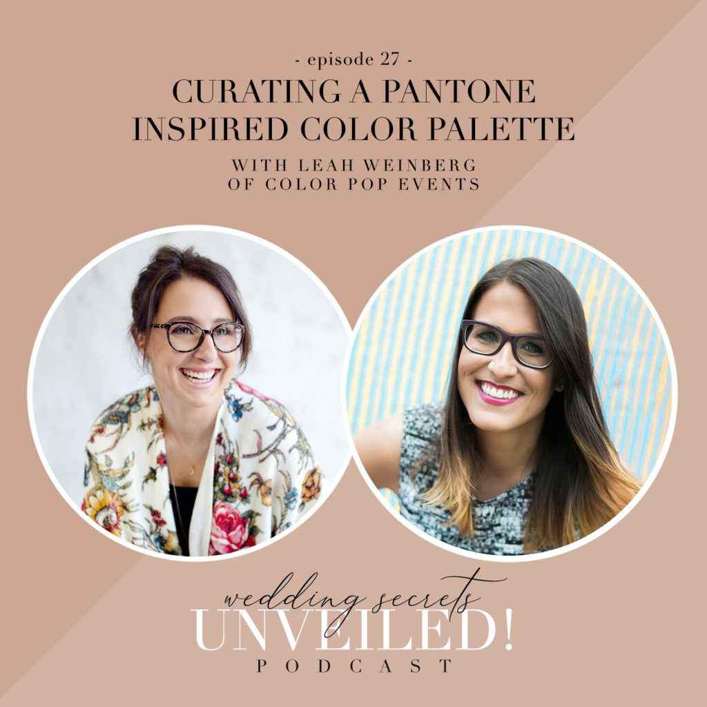
We’re so excited about this short and sweet episode about curating a Pantone inspired color palette for your event! Did you know that every year Pantone chooses a “color of the year”? When it comes time to plan your event, this color can inspire your choices in decor, attire, and so much more! Today, we’re talking with guest Leah Weinberg, the owner and creative director of Color Pop Events. She’s the author of “The Wedding Roller Coaster” and we’re thrilled to have her here to talk about incorporating the color of the year in your wedding planning!
Meet Leah.
I’m the owner of Color Pop Events, a wedding planning company based in New York City. I’ve been in business for about 8 and half years now. Prior to starting the company, I was a commercial real estate attorney, so it was quite a career shift – but you’d be surprised how many skills transferred between the two careers!
Can you tell us about the Pantone color of the year for 2022?
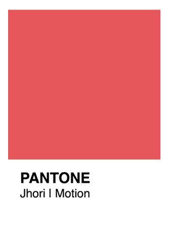
In December, they announced that “Perry” (as in Periwinkle) would be the color of the year! It’s a beautiful light shade of purple.
What was the initial reaction with this color for the year?
Personally, I loved it. It seemed like it was very polarizing, but I mean, color is color. I think you love it or you don’t. It’s a nice middle ground. If you’re more of a neutral person, you can still use this color without it being overwhelming. On the other hand, you can use it as a stepping point for an even vibrant color if that’s your thing, too.
Can you compare it with some of the colors of years past? What’s different about this year’s color?
What happened this year was very unique. They actually created a brand new color for 2022. In the past, they’ve selected existing colors. But, this year they went with something refreshing and exciting by creating a new color! Last year was a quieter yellow and gray. It was a dull combination, if you ask me. Now we have something different!
If our listeners are wondering what to do with the color, what would you suggest for them in the planning process?
Whether you want to keep things more neutral or go with a bolder option, there’s plenty of ways to incorporate this color. It’s going to be beautiful in floral arrangements because it’s a naturally occurring color. It will be easy for florists to use! You can include it with softer tones like light blues, pinks, and even white. I love incorporating colors into napkins, honestly! It’s a nice way to lightly incorporate your color over a white tablecloth. I think a dark and solid tablecloth can be overwhelming but use the pop of colors!
It would also be a beautiful color for bridesmaid dresses, boutineeres, pocket squares or other attire components. It’s really not super bold, but it’s enough color that it will add to your event!

Any tips for a couple who isn’t so sure about using color in their planning?
Like anything in the wedding industry, you don’t have to use it. When you plan your wedding, you’ll quickly determine if you want to be super on trend or just do what you love. Some people lean each way – and that’s 100% okay! It’s totally fine to not use it. If it’s not your thing, I’m just always a big proponent of doing what suits you, what feels comfortable to you, what really reflects you and your personalities. So if light purple is not your thing, then don’t feel like you have to use it at all.
If you had to give our listeners a quick tutorial on how to incorporate Perry for their day, what would you tell them?
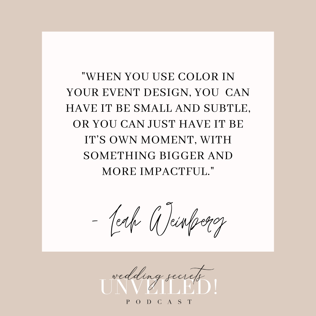
I think it’s sort of similar to what we talked about before. So bringing it into florals, bringing it in with linen choices in terms of napkins. I think it’s also a great color to incorporate into some of the paper goods. You can have it be small and subtle, or you can just have it be it’s own moment, with something bigger and more impactful.
What would you tell couples who are being asked about their color palettes while planning?
When you’re first engaged, people want to know about your colors, theme, and design right away. But really, it’s okay if you don’t know that right off the bat. Just say that you haven’t decided yet. Honestly, I feel like these are dated questions because not all people are going to necessarily have a theme. They may not have a color palette. And sometimes people change color palettes or change, whole design aesthetics during the wedding planning process. So I feel like it’s kind of a bizarre question to ask. But it’s also what can make sure that you’re working with somebody who gets you and understands your vision.

What are some suggestions that you can give our listeners who want to decide on a color palette?
I always suggest that clients put together a Pinterest board or some sort of collection of imagery and inspiration. As you pull together images, you’ll see patterns emerge. So you go and just add what you like. Don’t think about it too much. I think that’s kind of the way to back your way into a color palette.
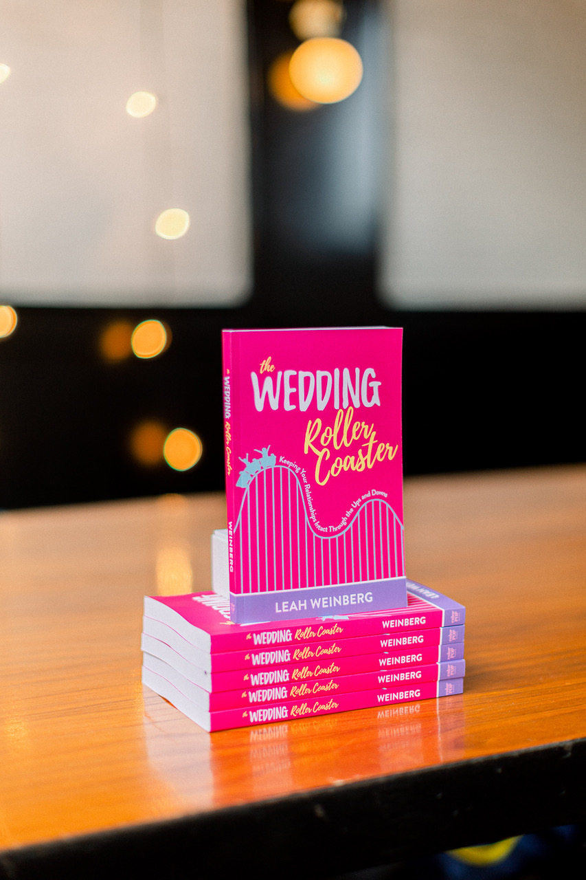
Love it. Can you tell our listeners a little bit about your new book?
During COVID-19, I wrote a book! I call it my “COVID silver lining” actually, because I wrote most of it during the quarantines. The book is called “The Wedding Roller Coaster” and it’s all about how to keep your relationship in tact through the ups and downs of wedding planning. I wrote it for engaged couples to help them prepare for the emotional side of wedding planning.
I feel like there are tons of resources, and books about how to actually plan – you know, all the checklists and etiquette – but I don’t think we talk about the emotional side of wedding planning enough.
In the middle of the wedding planning process, it can feel isolating and like you’re the first person to experience what you are. But, you’re not – and you’re not alone. So, I hope that this book can help couples remember they’re not doing this alone.
Wrap-Up Question
What are the key points couples should consider when choosing a color palette?
Identify your anchor color. Look at your Pinterest board or inspiration and see what the most common color is. Plan the rest of your colors around that one!
Remember the colors you pick at the start may not be what you have at the end! Other decisions along the way may change what your palette winds up being by the end of your planning process.
Play with the colors and have fun with it! Planning a wedding should be fun – allow yourself the space to play and keep an open mind.
Links Mentioned in the Episode
You can find Color Pop Events: Website | Instagram | Facebook | The Book
You can subscribe to this podcast from wherever you’re listening so you never miss an episode. And, we would so appreciate it if you left a fabulous review for our show on Apple podcast! Even better, share it with a friend. It’s a great way to show your support and let us know what you think. Thank you so much for listening!


")


